Palm Desert


Our gallery in Palm Desert is centrally located in the Palm Springs area of California, adjacent to the popular shopping and dining area of El Paseo. Our clientele appreciates our selection of Post War, Modern, and Contemporary art. The gorgeous weather during the winter months draws visitors from all over the world to see our beautiful desert, and stop by our gallery. The mountainous desert landscape outside provides the perfect scenic backdrop to the visual feast that awaits inside.
45188 Portola Avenue
Palm Desert, CA 92260
(760) 346-8926
Hours:
Monday through Saturday: 9am – 5pm
Exhibitions
ARCHIVE
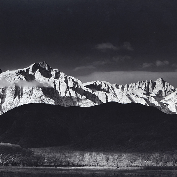
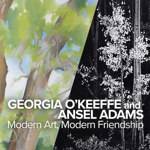
Georgia O’Keeffe and Ansel Adams: Modern Art, Modern Friendship

ARCHIVE
Your Heart’s Blood: Intersections of Art and Literature
ARCHIVE
More to Life: Impressionist Dialogues from Monet and Beyond
ARCHIVE
Jewish Modernism Part 2: Figuration from Chagall to Norman
ARCHIVE
Vincent van Gogh and The Great Impressionists of the Grand Boulevard
ARTWORK ON VIEW
,_new_mexico_tn40147.jpg "GEORGIA O'KEEFFE-Cottonwood Tree (Near Abiquiu), New Mexico")
GEORGIA O'KEEFFE

DIEGO RIVERA

Andrew Wyeth & N. C. Wyeth

WILLEM DE KOONING

N.C. WYETH

PIERRE-AUGUSTE RENOIR
_tn43950.jpg "WINSLOW HOMER-In the Wheatfield (Girl Standing in a Wheat Field)")
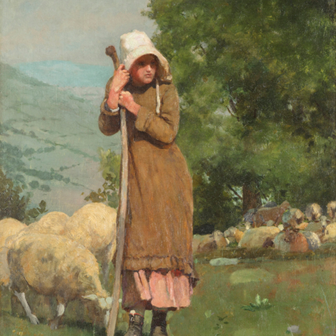
WINSLOW HOMER

RUFINO TAMAYO

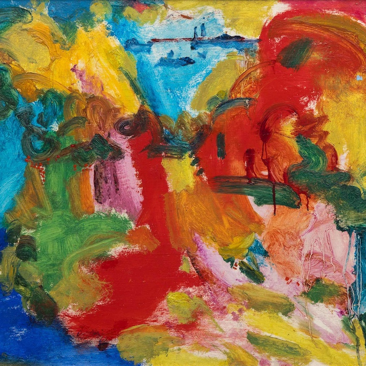
HANS HOFMANN

MARC CHAGALL

SEAN SCULLY

HANS HOFMANN

HANS HOFMANN

PIERRE BONNARD
_tn45106.jpg "CAMILLE CLAUDEL-La Vague (The Wave)")
CAMILLE CLAUDEL

DAMIEN HIRST

HANS HOFMANN

HANS HOFMANN

HANS HOFMANN
_tn27843.jpg "ELAINE DE KOONING-Untitled (Totem Pole)")
ELAINE DE KOONING

THÉO VAN RYSSELBERGHE

AMEDEO MODIGLIANI

HANS HOFMANN

HIROSHI SENJU

HANS HOFMANN

HERB ALPERT
_tn46214.jpg "HARRY BERTOIA-Untitled (Sounding Sculpture)")
HARRY BERTOIA

MAX WEBER

MEL RAMOS

CAMILLE PISSARRO

JULIAN SCHNABEL

HERB ALPERT

ROGER BROWN

HANS HOFMANN

ROLAND PETERSEN

JOHN CHAMBERLAIN

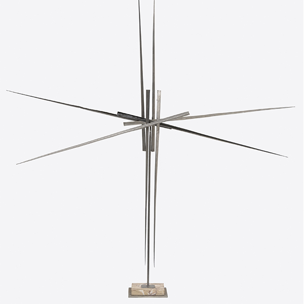
GEORGE RICKEY

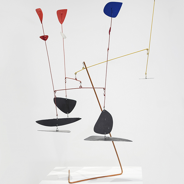
ALEXANDER CALDER

ALEXANDER CALDER

ALEXANDER CALDER
_tn39239.jpg "ANDY WARHOL-Diamond Dust Shoes (Black and White)")
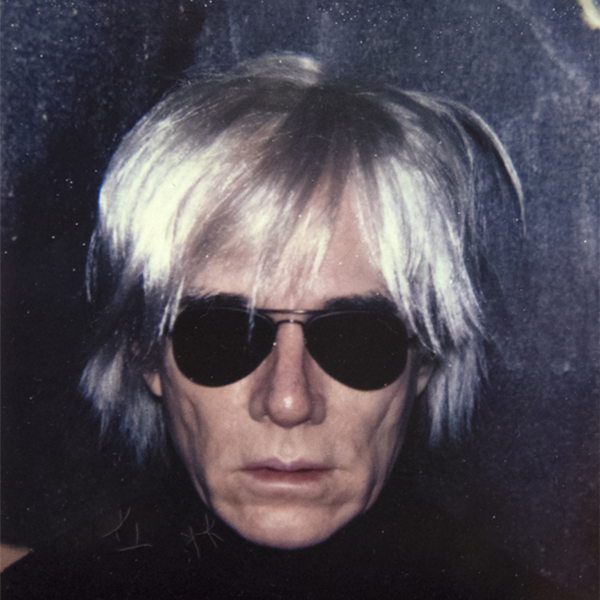
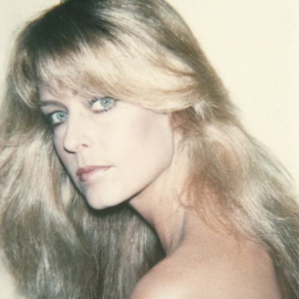
ANDY WARHOL

MICHAEL CORINNE WEST
_tn46616.jpg "RICHARD PRINCE-Untitled (Censor Painting Pink)")
RICHARD PRINCE

ALEXANDER CALDER

KIKI SMITH

DEBORAH BUTTERFIELD

THÉO VAN RYSSELBERGHE

JOAN MIRO

MANUEL NERI

RYAN MCGINNESS
_tn28596.jpg "DEBORAH BUTTERFIELD-Untitled (Horse)")
DEBORAH BUTTERFIELD

HERB ALPERT

HERB ALPERT

PAUL GAUGUIN

MANUEL NERI

MANUEL NERI

ANDY WARHOL

MARIA BLANCHARD

MARIA BLANCHARD

CHINESE

CHINESE
_tn47033.jpg "HARRY BERTOIA-Untitled (Willow)")
HARRY BERTOIA

JOSEPH STELLA

WILLIAM WENDT

MARC QUINN

VALERIE JAUDON

RICHARD ANUSZKIEWICZ
_tn16764.b.jpg "HARRY BERTOIA-Untitled (Suspended Willow)")
HARRY BERTOIA
_tn40803.jpg "JOANNA POUSETTE-DART-Untitled (Red Desert Study)")
JOANNA POUSETTE-DART

SETH KAUFMAN

CHINESE

LÉON AUGUSTIN LHERMITTE

FRANCISCO TOLEDO

MEL RAMOS

AI WEIWEI

CHINESE

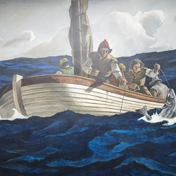
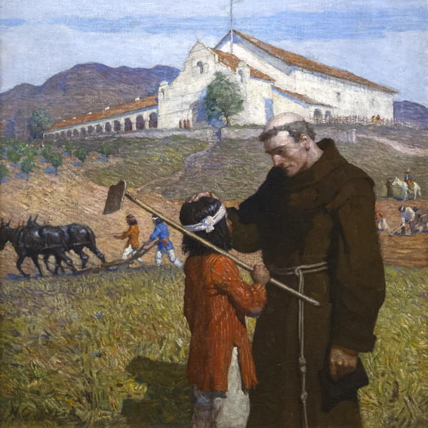
NORMAN ROCKWELL
IN THE NEWS
NEWS

Recently Sold Top Works
NEWS

Gibson, Dunn & Crutcher Installations
NEWS

Sell Your Blue Chip Works With Heather James
NEWS

Heather James Fine Art Museum Loans
NEWS

Claude Monet Recently Sold Works
NEWS

The Art Market March 2023
NEWS

Van Gogh loans to the Detroit Institute of Arts
PRESS
Heather James loaned Van Gogh included in “Van Gogh in America” draws crowd
PRESS
Heather James loans major Van Gogh to “Van Gogh in America”
NEWS

Art Market Resilience
NEWS

Art as an Investment
NEWS

Luxury Home Installation
VIDEO

May 2022 Art Auction Season Recap with Jim Carona
PRESS

Curator Chip Tom Helps Inside the Desert Oasis Show House
PRESS

Iconic Life profiles the HJFA curated Desert Oasis Show House
PRESS
Chip Tom Guest Judge
VIDEO

Getting to Know Heather James Fine Art
NEWS

Celebrating 25 Years of Heather James Fine Art
NEWS

Heather James Opens London Consultancy
CATALOGS

Revolutions in Modern Art
CATALOGS

Heather James Fine Art – About Us
VIDEO

Hassel Smith Opening Reception
SERVICES
Heather James Fine Art provides a wide range of client-based services catered to your specific art collecting needs. Our Operations team includes professional art handlers, a full registrar department and logistical team with extensive experience in art transportation, installation, and collection management. With white glove service and personalized care, our team goes the extra mile to ensure exceptional art services for our clients.


GET TO KNOW US
FEATURED ART
_tn47012.jpg "CLYFFORD STILL-Untitled (PH-589)")
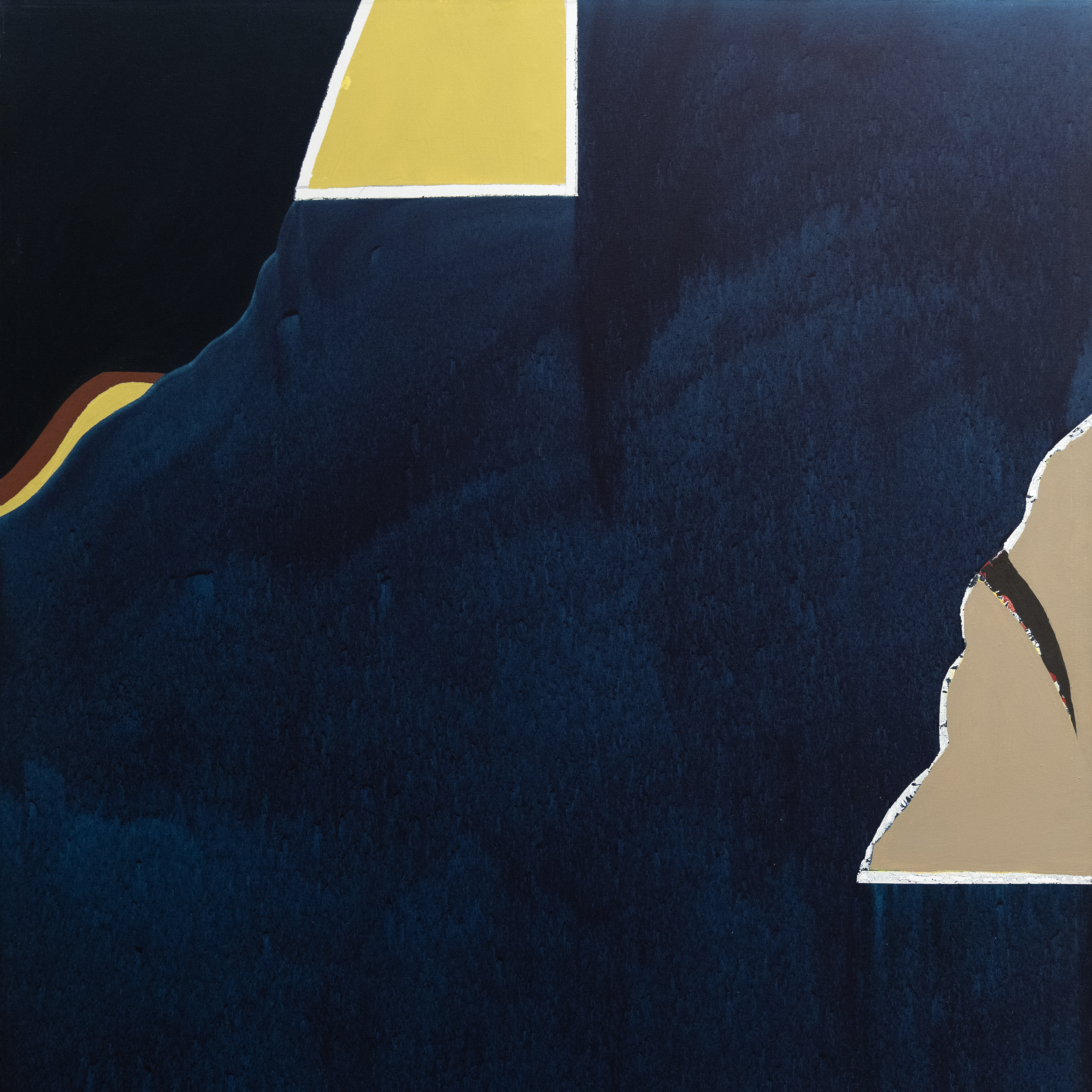
CLYFFORD STILL
GEORGIA O'KEEFFE
DIEGO RIVERA
Andrew Wyeth & N. C. Wyeth
N.C. WYETH
WILLEM DE KOONING

TOM WESSELMANN

AI WEIWEI

ALFRED SISLEY
PIERRE-AUGUSTE RENOIR

EMIL NOLDE
WINSLOW HOMER

GERHARD RICHTER
RUFINO TAMAYO
HANS HOFMANN

KENNETH NOLAND
MARC CHAGALL
SEAN SCULLY

TOM WESSELMANN

ALBERT BIERSTADT

IRVING NORMAN